Two days ago, MIT economist Jeffrey Harris wrote a paper claiming that the subways seeded the COVID-19 epidemic in New York, but the paper has been widely criticized. The Tri-State Transportation Campaign, for example, slammed it because it was "not peer-reviewed, lack proper modeling, and ... does not support any causation. It is more opinion than scientific research." Alon Levy analyzed the report fully and concluded that it was not "a serious argument." Here is Levy's analysis.
In multiple other countries, one cannot see the transit cities in the virus infection rates. In Germany the rates in the largest cities are collectively the same as in the rest of the country. In South Korea, the infection is centered on Daegu; Seoul’s density and high transit usage are compatible with an infection rate of about 700 in a city of 9.5 million, about 1.5 orders of magnitude less per capita than in most Western countries and 2.5 orders of magnitude less than in New York. In Taipei, the MRT remains crowded, with weekday ridership in February and March down by 15-16 percent. In Italy, car usage is high outside a handful of very large cities like Milan, and Milan’s infection rate isn’t high by the standards of the rest of Lombardy.
However, rest-of-world evidence does not mean that the New York City Subway is safe. The Taipei MRT has mandatory mask usage and very frequent cleaning. German U- and S-Bahn networks are a lot dirtier than anything I’ve seen in Asia, but much cleaner than anything I’ve seen in New York, and also have much less peak crowding than New York. New York uniquely has turnstiles requiring pushing with one’s hands or bodies, and the only other city I know of with such fare barriers is Paris, whose infection rates are far below New York’s but still high by French standards.
So the question is not whether rapid transit systems are inherently unsafe for riders, which they are not. It’s whether New York, with all of its repeated failings killing tens of workers from exposure to the virus, has an unsafe rapid transit system. Nonetheless, the answer appears to be negative: no evidence exists that the subway is leading to higher infection rates, and the paper does not introduce any.
What’s in the paper?
A lot of rhetoric and a lot of lampshade hanging about the lack of natural experiments.
But when it comes to hard evidence, the paper makes two quantitative claims. The first is in figure 3: Manhattan had both the least increase in infections in the 3/13-4/7 period, equivalent to a doubling period of 20 days whereas the other boroughs ranged between 9.5 and 14, and also the largest decrease in subway entries in the 3/2-16 period, 65 percent whereas the other boroughs ranged between 33 percent and 56 percent.
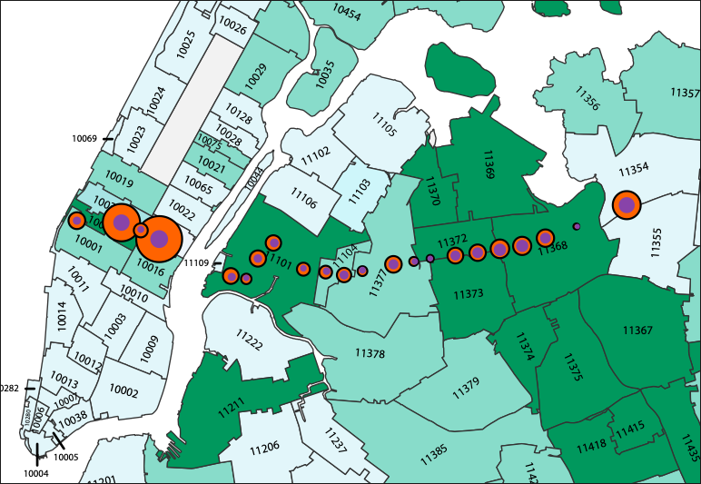
The second is a series of maps showing per capita infection levels by ZIP code, similar to the one here. The paper also overlays a partial subway map and asserts that the map shows that there is correlation of infection rates along specific subway routes, for example the 7, as people spread the disease along the line.
Neither is even remotely correct.
Can you see the subway on an infection map?
Here's a static version of the infection map by zip code (right).
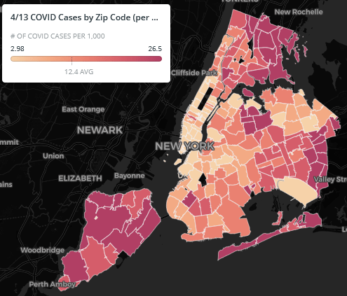
This is cases for 1,000 people – note that my post about Germany looks at rates per 10,000 people, so the range in New York is consistently about an order of magnitude worse than in Germany. The map shows high rates in Eastern Queens, the North Bronx, and Staten Island, hardly places with high public transportation ridership. The rates in Manhattan and the inner parts of Brooklyn are on the low side.
There are no ribbons of red matching any subway line – there are clumps and clusters, as in Southern Brooklyn in Orthodox Jewish neighborhoods, and in Central Queens around Corona and East Elmhurst. There is imperfect but noticeable correlation with income – working-class areas have higher infection rates, perhaps because they have higher rates at which people are required to still show up to work, where they can be infected. East Asian neighborhoods have lower rates, like Flushing and environs, or to some extent Sunset Park; Asians are infected at noticeably lower rates than others in New York and perhaps in the rest of the Western world, perhaps because they took news in China more seriously, began practicing social distancing earlier, and wear masks at higher rates. There are many correlates, none of which looks like it has anything to do with using the public transportation network.
What’s more, the MIT paper is not making any quantitative argument why the graph shows correlation with subway usage. It shows the graph with some lines depicted, often misnamed, for example the Queens Boulevard Line is called Sixth Avenue Local, leading to a discussion about higher infection rates on local trains than on express trains where in fact the F runs express in Queens. But it does not engage in any analysis of rates of subway usage or changes therein, or in infection rates. The reader is supposed to eyeball the graph and immediately agree with the author’s conclusion, where there is no reason to do so.
Manhattan confounders
The claim about Manhattan is the only real quantitative claim in the paper. Unlike the zip code analysis, the borough analysis does make some statistical argument: Manhattan had larger reduction in subway usage than the rest of the city and also a slower infection rate. However, this argument relies on an N of 2. Among the other boroughs, there is no such correlation. The argument is then purely about Manhattan vs. the rest of the city. This is incorrect for so many reasons:
- Manhattan is the highest-income borough, with many people who can work from home. If they’re not getting infected, it could be from not commuting as much, but just as well from not getting the virus at work as much.
- The Manhattan subway stops are often job centers, so the decline in ridership there reflects a citywide decline. A Manhattanite who stops taking the subway is seen as two fewer turnstile entries in Manhattan, whereas a New Yorker from the rest of the city who does the same is likely to be seen as one fewer Outer Borough entry and one fewer Manhattan entry.
- Many Manhattanites left the city to shelter elsewhere, as seen in trash collection data.
- Manhattan’s per capita subway usage is probably higher than that of the rest of the city counting discretionary trips, so 65 percent off the usual ridership in Manhattan may still be higher per capita than 56 percent off in Brooklyn or 47 percent in Queens. (But this is false on the level of commuting, where Manhattan, the Bronx, and Brooklyn all have 60 percent mode share.)
Does the paper have any value?
No.
I have heard people on Twitter claim that correlation is not causation. This argument is too generous to the paper, which has not shown any correlation at all, since the only quantitative point it makes has an N of 2 and plenty of confounders.
For comparison, my analysis of metro construction costs has an effective N of about 40, since different subway projects in the same country tend to have similar costs with few exceptions (such as New York’s extreme-even-for-America costs), and I consider 40 to be low enough that Eric Goldwyn and I must use qualitative methods and delve deep into several case studies before we can confidently draw conclusions. The paper instead draws strong conclusions, even including detailed ones like the point the paper tries to make about local trains being more dangerous than express trains, from an N of 2; it’s irresponsible.
But what about the workers?
A large and growing number of New York City Transit workers have succumbed to the virus. The current count is close to the citywide death toll, but transportation workers are by definition all healthy enough to be working, whereas citywide (and worldwide) the dead are disproportionately old or have comorbidities like heart disease. Echoing the union’s demands for better protection, Andy Byford had unkind words to say about Governor Andrew Cuomo’s appointees in charge of the system, MTA Chairman Pat Foye and acting NYCT chair Sarah Feinberg.
However, this is not the same as infection among passengers. The dead include workers who are in close proximity to passengers on crowded vehicles, such as bus drivers, but also ones who are not, such as train operators, maintenance workers, and cleaners. Train cleaners have to remove contaminated trash from the platforms and vehicles without any protective equipment; NYCT not only didn’t supply workers with protective equipment, but also prohibited them from wearing masks on the job even if they’d procured them privately. Contamination at work is not the same as contamination during travel.
So, should people avoid public transportation in New York?
Absolutely not.
If the best attempt to provide evidence that riding the subway is a health hazard in a pandemic is this paper, then that by itself is evidence that there is no health hazard. This is true even given New York City Transit’s current level of dirt, though perhaps not given its pre-crisis peak crowding level. Social distancing is reducing overall travel and this is good, not necessarily because travel is hazardous, but mostly because the destination is often a crowded place with plenty of opportunity for person-to-person infection.
In preparation for going back to normal, the current level of cleanliness is not acceptable. The state should make sure people have access to masks, even if they’re ordinary ones rather than N95 ones, and mandate their usage in crowded places including the subway once they are available. It should invest far more in cleaning public spaces, including the subway, to the highest standards seen in the rich countries of Asia. It should certainly do much more to protect the workers, who face more serious hazards than the riders. But it should not discourage people who are traveling from doing so by train.
Alon Levy started their career solely as a mathematician, but their side interest in urbanism and mass transit has led to a career entirely writing about public transit full-time. They live in Paris, but has lived all over the world.