New York City unveils controversial revamp of "I ♥ NY" logo
The City of New York has released an updated version of its unofficial emblem – Milton Glaser's iconic "I ♥ NY" logo – as part of a citywide campaign to "inspire optimism and civic action" post-pandemic.
The updated wordmark, created by graphic designer Graham Clifford, reads "WE ♥ NYC" in a blocky sans serif typeface instead of the typewriter-style font used in the original 1977 design.
Flying in the face of the flat logo trend, the 21st-century version features a shaded, three-dimensional heart reminiscent of an emoji.
The logo will star in ads across the city as part of an eight-week campaign spearheaded by New York City mayor Eric Adams, governor Kathy Hochul and the non-profit Partnership for New York City.
The aim is to cut through the social and political divides highlighted by the pandemic and instead encourage collective action to regenerate the city in the form of community cleanups, promotions for neighbourhood businesses and other activities.
"The 'We ♥ NYC' campaign asks everyone who loves the greatest city in the world to show it by lending a helping hand and spreading that love to every block across all five boroughs," said mayor Adams.
This idea of community spirit is reflected in the logo's use of the collective pronoun "we" instead of the singular "I", while its new font references the Helvetica signage of New York's subway system, which Clifford described as "the beating heart of the city".
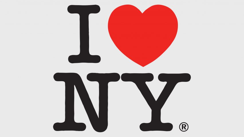
The updated logo is not meant to replace the universally recognisable "I ♥ NY" design, which Bronx-born graphic designer Milton Glaser first sketched in the 70s while sitting in the back of a taxi, and which has since been reproduced thousands of times in the form of both licensed and unlicensed merchandise.
But the new logo still sparked backlash from designers and New Yorkers alike, with Adobe's executive vice president of design Scott Belsky arguing it lacked "anything that feels timeless or iconic".
Design reporter Katie Deighton took aim at the logo's inconsistent spacing, tweeting that it would likely have Glaser "kerning in his grave", while Futurism's design director Tag Hartman-Simkins commented that the wordmark looked like it had been "feedbacked into the ground".
"I can't imagine any person with a background in graphic design made that thing without a committee of bland politicians sanding away its edges until they felt safe enough to unveil that to the public," he told the New York Times.
The campaign's organisers maintain that its aim to "inspire optimism and civic action" is in line with the spirit of Glaser's original design, which was created as part of an advertising campaign by the State of New York to fight growing unemployment and promote tourism among rising crime rates.
"The original I ♥ NYC campaign was launched in 1977 in the midst of an urban crisis," they wrote. "Its aim was to reignite the can-do optimism of New Yorkers, to mobilise volunteer action to build a safer, cleaner, more prosperous city, and to ensure that New York City would remain a great place to live, work and visit."
"We ♥ NYC is a 21st-century version of the 70s campaign. Once again, New Yorkers are coming together to mobilise civic action and community engagement as the catalyst for a renaissance of the city and its neighbourhoods."
Before this most recent iteration of the logo, Glaser already reimagined the design himself once before following the September 11 attacks, adapting it to say "I ♥ NY More Than Ever".
The designer, who passed away in 2020, used his work to advocate for many of the causes he cared about, whether raising awareness for climate change, encouraging people to vote or mobilising action around the AIDS epidemic in the 80s.
All images courtesy of Graham Clifford and the New York State Departm.ent of Economic Development.