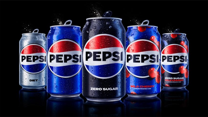
Pepsi unveils "unapologetic" logo focused on brand's heritage
Drinks brand Pepsi has unveiled its first rebrand in 14 years with an updated logo that draws on its 1990s branding and uses black wording to draw attention to Pepsi Zero Sugar.
Released to mark the brand's 125th anniversary, the rebrand aims to draw on Pepsi's history while focusing on its future and its "commitment to Pepsi Zero Sugar".
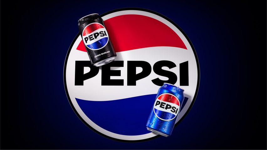
"In approaching the new design, we asked ourselves: how do we take everything we love about Pepsi and its past, and create something that transcends?" PepsiCo chief design officer Mauro Porcini told Dezeen.
"We designed the new visual identity to connect future generations with our brand's heritage, transcending everything we know and love about the brand to create something current and undeniably Pepsi."
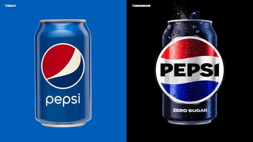
The rebrand retains the Pepsi globe, which has been central to the logo since the 1950s, but returns it to the flattened version used in the late 1980s and 1990s.
"We want to instigate moments of unapologetic enjoyment," said Porcini. "We've always been a bold and energetic brand – now our visual identity better matches our attitude."
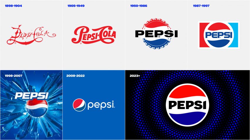
As part of the redesign, the word Pepsi was placed back in the centre of the globe and written in a custom, capitalised font. The in-house PepsiCo design team chose black for the word Pepsi in contrast to previous versions in white and blue.
The colour black, which also encircles the globe logo, aims to draw attention to the zero-sugar version of the drink. Black has traditionally been the colour related to Pepsi Zero Sugar.
"The Black lettering was a creative design choice to bring more boldness and contrast to the logo while also paying homage to our focus on Pepsi Zero Sugar," said Porcini.
"In our updated colour palette, the colour black is bold and creates a beautiful contrast with the electric blue. Black has also always signified Pepsi Zero Sugar, which is a huge area of focus and growth driver for brand Pepsi."
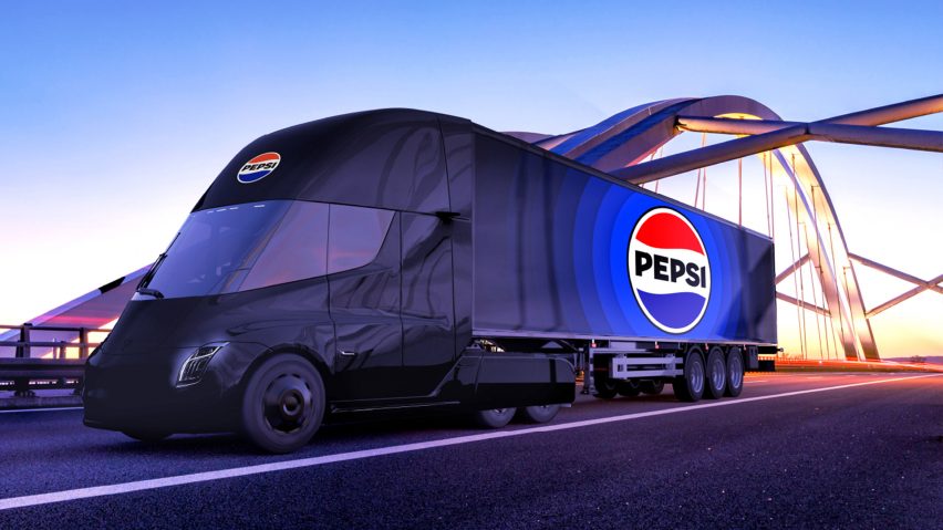
The rebrand was launched as Pepsi also announced that in the UK it has dramatically reduced the amount of sugar in the original version of the drink.
The new Pepsi recipe, which is only available in the UK, will have 57 per cent less sugar than the current version. It will contain 4.6 grams of sugar per 100 millimetres compared with the previous 10.7 grams of sugar per 100 millimetres.
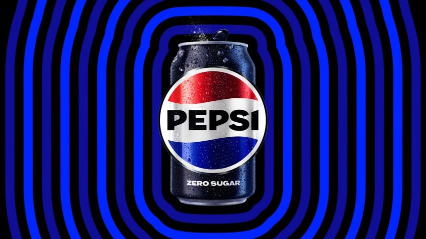
Alongside the introduction of black, PepsiCo also chose a darker version of blue than in previous versions of the logo. Described by the brand as "electric blue", this colour combined with the black aims to give "vibrancy, and a contemporary edge to the classic Pepsi color scheme".
The logo will be rolled out on all of Pepsi's physical products and packaging in North America this year and globally in 2024.
The updated Pepsi logo follows the beverage company unveiling new branding for soft drink 7Up, which was designed to reinforce the uplifting nature of the brand.