Samsung Galaxy S5's screen is far from the best, here's why
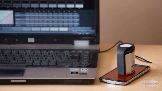
The Samsung Galaxy S5's screen turned out so controversial when the phone came out last month, that fans were instantly split between those who held that it's the best mobile screen ever, and those who believed that the screen was good, but could be a lot better. We ended up in the latter group, and while we've explained our reasons time and time again, we think this topic deserves one final and conclusive post, just to make things extra clear.
We know some readers like to point at a fairly popular source of screen analysis, who recently claimed that the GS5 has the most accurate phone screen ever (we're looking at you, DisplayMate). Shortly afterwards, numerous reports, including ours, stated the opposite. In short - no, the Galaxy S5 does not have the most accurate screen, and it's actually very far from that. Here's why...
The GS5 offers you a number of 'screen modes', which tweak the color reproduction characteristics of its Super AMOLED screen. We've measured them all (using gear and software designed for this purpose), and have concluded that none of its screen modes offer image that could be considered accurate or true-to-life. Note that all of our measurements have been made at 200 nits, but we've also made sure to check if things don't get better if we crank the brightness all the way up - they don't.
Color temperature
The default mode of the GS5's display is 'Standard mode', and it has a very high color temperature of about 8100 K. With the reference point for screen color temperature being 6500 K, this means that the Samsung Galaxy S5 will display colors that are decidedly bluish (cold). This is so, because the blue color, reproduced by the display, has a higher intensity than the other main colors - red and green. Meanwhile, handsets equipped with quality IPS LCD screens exhibit color temp that's much closer to the standard, often gravitating around the 7000 K mark. If you set the Galaxy S5 to the so-called Cinema mode, its color temperature gets considerably better at around 7300 K, but there's still a lot of red color lacking, making for visuals that we'd describe as 'lifeless'.
In the series of greyscale charts right below, you can easily see how the color temperature of the Galaxy S5's different screen modes differs from the reference one. In the fifth image, you'll see the Nexus 5's greyscale - we've put the measurements of its IPS LCD display for reference. Obviously, the measured levels of grey in the Nexus 5's image are much closer to the reference ones than any of the Galaxy S5's.
Delta E
Another component is Delta E, which represents the average amount of 'color error' exhibited by the display in question. This is another area where it gets obvious that there's quite a bit of room for improvement for Samsung's Super AMOLED screens. In short, Delta E values have to be as low as possible to indicate a more color-accurate display. It's believed that Delta E values below 2 basically mean a level of color inaccuracy that's pretty much undetectable by the human eye. For the Galaxy S5 in Standard mode, these figures stand at 5.08 (when measuring the three primary plus three secondary colors (red, green, blue + cyan, magenta, yellow)), and 7.38 when measuring a grayscale (depends on the balance between the three primary colors). These numbers are quite high, when you take into account the significantly lower Delta E values of IPS LCD handsets like the iPhone 5s or One (M8). For the 5s, these same numbers stand at 3.36 and 2.66, and for the M8, they are 4.33 and 4.82. In the greyscale Delta E measurement, the Galaxy S5's 7.38 value is so high, because the measurement is detecting a massive imbalance between the primary colors - blue and green are much more intensive than red.
Switching to the overly-hyped Cinema mode, things get slightly better on paper (Delta E greyscale of 5.86 and Delta E rgbcmy of 3.97), because all colors get desaturated a bit, pulling them closer towards the reference values. Still, this doesn't really cut it here, because it all just makes for an undersaturated red, as well as blue and green colors that are still beyond the desired intensity. So, yeah, things start looking a bit better on paper, but in reality, the picture that comes out appears dull and mostly greenish, with color temp that is still high.
Keep in mind that the following color charts are designed to show how big the differences are between the measured and reference colors, and not to depict how any of these colors should actually look in reality.
In the following images, we're comparing the color reproduction of the Galaxy S5 to that of the Nexus 5, which we've chosen for a reference display. The Nexus 5 has a way more accurate display and better color balance. Take a look at the visual differences below!
Color gamut
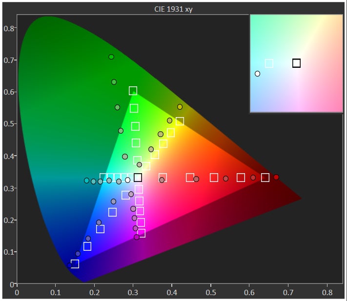
We often hear: "This screen has incredible color range, because it covers ~130% of the sRGB gamut!" If you came across such kind of statement - you'd do yourself a favor if you disregard it. First of all, even if a display covers more colors than what's outlined by the sRGB standard, that in no way means that color balance will be right and everything will look good, let alone better than an sRGB-compliant displаy. Having a larger color gamut simply means that the display in question is capable of reproducing a wider spectrum of colors. That's good, but the thing is that mobile operating systems aren't color-calibrated, meaning that the display will take a certain color and reproduce a different color, because no software tells it exactly what color should be displayed. That's bad, because colors on such a display won't look as intended. The sRGB standard is universally used by most media available out there, including the Internet, and operating systems, such as Android. This means that the color characteristics of interface elements, applications, etc. are all designed with sRGB colors in mind. If your display cannot "read" those colors correctly, it'll display them differently. Such is the case with the Super AMOLED screen of the Android-powered Galaxy S5. For example, there might be a web page with light blue design elements, but on the GS5, there's a big chance that it'll appear as a more intense, more saturated form of blue - meaning you won't be seeing things as they are supposed to look. End of story. That's what's bad about having such a wide-gamut display on a smartphone.
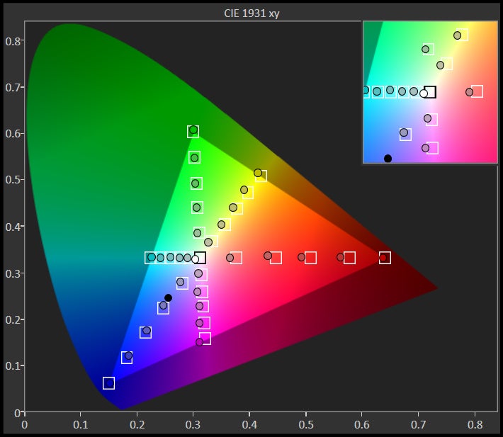
Right underneath this paragraph, you'll see a series of color gamut charts, showcasing the measurements we've made with the Galaxy S5's screen in all its different modes. As you can see, in pretty much all modes, the dots (representing the actual measured data) are way out of the highlighted triangle, which represents the sRGB standard color space. This suggests colors that are way too intense than they are supposed to be. In normal circumstances, if we had a perfectly calibrated display, the dots would be positioned right inside the empty squares. If you switch to the last image (5), you'll see the color gamut chart of the Nexus 5, which is equipped with a well-calibrated IPS LCD screen. As you can see there, the dots, or actual measured colors, are much closer to the squares inside the triangle, and often fit right into place. That's how a color-accurate display is supposed to look. Back to the measurements of the Galaxy S5, we can acknowledge the fact that the measured gamut in Cinema mode is a bit closer to the reference sRGB one, but unfortunately the undersaturated red, in combination with the still-too-intensive green and blue makes for a pretty lifeless overall image.
Gamma
Now, let's move on to another very important important component of a display - gamma. Gamma determines if the levels of brightness are correct, considering the input material. For example, if the maximum brightness of a display is 100 nits (and the display is set to its maximum setting), then a 100% grey color (which is white color) should be displayed with 100 nits. 10% grey color (which is very, very dark grey), should be displayed with 10 nits. 50% grey should be displayed with 50 nits, and so on. Generally, average gamma should stand at 2.2, and the Galaxy S5 is very close to that number with its 2.25 (in Standard mode). There are few handsets, like the iPhone 5s, which get even closer to 2.2, but overall, the S5 does perfectly well in this respect, meaning that it's not trying to artificially make things too contrasty (higher gamma often results more contrasty images).
Brightness
Now that we've proven that there's still a lot of work ahead of Samsung with regards to color accuracy, let's take a moment to discuss the company's claim of maximum brightness of up to 698 nits. In short, in 99% of possible usage scenarios, the Galaxy S5 cannot display content with such great brightness. With the phone's 'Adapt display' option switched to on, the Galaxy S5 can go up to about 440 nits while displaying a completely white screen - this is the standard way of testing a display's brightness. Now, 440 nits is a decent output, but it's obviously far from the 698-nit claim. So, how do you achieve such great brightness with this display?
Conclusion
Our goal with this article wasn't to prove that the screen of the Galaxy S5 is bad. Instead, our goal was to prove that it's not the best mobile screen there is, and that it's simply far from accurate, as a whole. It's an imbalanced display with a lot of drawbacks. However, it's also one that's admittedly eye-catching and impressive. So, if you're willing to sacrifice color accuracy for added punchiness, that's totally fine, but don't blame us when you play a video and skin tones start coming out orange-ish. Also, don't blame us if you order a pair of seemingly greenish sneakers, and you get yellow ones instead. Blame Samsung! That's the price you have to pay in exchange for those ultra-vibrant visuals.
While all the color measurements used in this article have been done by us, we'd like to point out that other sources, including Erica Griffin and AnandTech have also reached similar conclusions - the Galaxy S5's screen is definitely not the best and most accurate mobile screen around.
Should we consider this case closed now?







Things that are NOT allowed: